Tuesday, May 31, 2011

There is only one test!

UPDATE: Here is a more recent (and I think clearer) version of this post.

A few weeks ago I started reading reddit/r/statistics regularly.  I post links to this blog there and the readers have given me some good feedback.  And I have answered a few questions.

One of the most commons question I see is something like, "I have some data.  Which test should I use?"  When I see this question, I always have two thoughts:

1) I hate the way statistics is taught, because it gives students the impression that hypothesis testing is all about choosing the right test, and if you get it wrong the statistics wonks will yell at you, and

2) There is only one test!  

Let me explain.  All tests try to answer the same question: "Is the apparent effect real, or is it due to chance?"  To answer that question, we formulate two hypotheses: the null hypothesis, H0, is a model of the system if the effect is due to chance; the alternate hypothesis, HA, is a model where the effect is real.

Ideally we should compute the probability of seeing the effect (E) under both hypotheses; that is P(E | H0) and P(E | HA).  But formulating HA is not always easy, so in conventional hypothesis testing, we just compute P(E | H0), which is the p-value.  If the p-value is small, we conclude that the effect is unlikely to have occurred by chance, which suggests that it is real.

That's hypothesis testing.  All of the so-called tests you learn in statistics class are just ways to compute p-values efficiently.  When computation was expensive, these shortcuts were important, but now that computation is virtually free, they are not.

And the shortcuts are often based on simplifying assumptions and approximations.  If you violate the assumptions, the results can be misleading, which is why statistics classes are filled with dire warnings and students end up paralyzed with fear.

Fortunately, there is a simple alternative: simulation.  If you can construct a model of the null hypothesis, you can estimate p-values just by counting.  This figure shows the structure of the simulation.


The first step is to get data from the system and compute a test statistic.  The result is some measure of the size of the effect, which I call "delta".  For example, if you are comparing the mean of two groups, delta is the difference in the means.  If you are comparing actual values with expected values, delta is a chi-squared statistic (described below) or some other measure of the distance between the observed and expected values.

The null hypothesis is a model of the system under the assumption that the apparent effect is due to chance.  For example, if you observed a difference in means between two groups, the null hypothesis is that the two groups are the same.

The next step is to use the model to generate simulated data that has the sample size as the actual data.  Then apply the test statistic to the simulated data.

The last step is the easiest; all you have to do is count how many times the test statistic for the simulated data exceeds delta.  That's the p-value.

As an example, let's do the Casino problem from Think Stats:

Suppose you run a casino and you suspect that a customer has replaced a die provided by the casino with a ``crooked die''; that is, one that has been tampered with to make one of the faces more likely to come up than the others.  You apprehend the alleged cheater and confiscate the die, but now you have to prove that it is crooked.  You roll the die 60 times and get the following results: 
Value       1    2    3    4    5    6 
Frequency   8    9   19    6    8   10 
What is the probability of seeing results like this by chance?
The null hypothesis is that the die is fair.  Under that assumption, the expected frequency for each value is 10, so the frequencies 8, 9 and 10 are not surprising, but 6 is a little funny and 19 is suspicious.

To compute a p-value, we have to choose a test statistic that measures how unexpected these results are.  The chi-squared statistic is a reasonable choice: for each value we compare the expected frequency, exp, and the observed frequency, obs, and compute the sum of the squared relative differences:


def ChiSquared(expected, observed):
    total = 0.0
    for x, exp in expected.Items():
        obs = observed.Freq(x)
        total += (obs - exp)**2 / exp
    return total


Why relative?  Because the variation in the observed values depends on the expected value.  Why squared?  Well, squaring makes the differences positive, so they don't cancel each other when we add them up.  But other than that, there is no special reason to choose the exponent 2.  The absolute value would also be a reasonable choice.

For the observed frequencies, the chi-squared statistic is 20.6.  By itself, this number doesn't mean anything.  We have to compare it to results from the null hypothesis.

Here is the code that generates simulated data:


def SimulateRolls(sides, num_rolls):
    """Generates a Hist of simulated die rolls.
    
    Args:
      sides: number of sides on the die
      num_rolls: number of times to rolls


    Returns:
      Hist object
    """
    hist = Pmf.Hist()
    for i in range(num_rolls):
        roll = random.randint(1, sides)
        hist.Incr(roll)
    return hist


And here is the code that runs the simulations:


    count = 0.
    num_trials = 1000
    num_rolls = 60
    threshold = ChiSquared(expected, observed)


    for _ in range(num_trials):
        simulated = SimulateRolls(sides, num_rolls)
        chi2 = ChiSquared(expected, simulated)
        if chi2 >= threshold:
            count += 1
    
    pvalue = count / num_trials
    print 'p-value', pvalue


Out of 1000 simulations, only 34 generated a chi-squared value greater than 20.6, so the estimated p-value is 3.4%.  I would characterize that as borderline significant.  Based on this result, I think the die is probably crooked, but would I have the guy whacked?  No, I would not.  Maybe just roughed up a little.

For this problem, I could have computed the sample distribution of the test statistic analytically and computed the p-value quickly and exactly.  If I had to run this test many times for large datasets, computational efficiency might be important.  But usually it's not.

And accuracy isn't very important either.  Remember that the test statistic is arbitrary, and the null hypothesis often involves arbitrary choices, too.  There is no point in computing an exact answer to an arbitrary question.

For most problems, we only care about the order of magnitude: if the p-value is smaller that 1/100, the effect is likely to be real; if it is greater than 1/10, probably not.  If you think there is a difference between a 4.8% (significant!) and 5.2% (not significant!), you are taking it too seriously.

So the advantages of analysis are mostly irrelevant, but the disadvantages are not:

1) Analysis often dictates the test statistic; simulation lets you choose whatever test statistic is most appropriate.  For example, if someone is cheating at craps, they will load the die to increase the frequency of 3 and/or 4, not 1 and/or 6.  So in the casino problem the results are suspicious not just because one of the frequencies is high, but also because the frequent value is 3.  We could construct a test statistic that captures this domain knowledge (and the resulting p-value would be lower).

2) Analytic methods are inflexible.  If you have issues like censored data, non-independence, and long-tailed distributions, you won't find an off-the-shelf test; and unless you are a mathematical statistician, you won't be able to make one.  With simulation, these kinds of issues are easy.

3) When people think of analytic methods as black boxes, they often fixate on finding the right test and figuring out how to apply it, instead of thinking carefully about the problem.

In summary, don't worry about finding the "right" test.  There's no such thing.  Put your effort into choosing a test statistic (one that reflects the effect you are testing) and modeling the null hypothesis.  Then simulate it, and count!

Added June 24, 2011: For some additional examples, see this followup post.

Wednesday, May 4, 2011

Think Stats will be published by O'Reilly in June

No statistics today, just news.  I signed a contract with O'Reilly to publish Think Stats.  I turn in the manuscript next week, and it should be out in June.  So if you find any errors, now is the time to tell me!

Here's my new author page at O'Reilly.

Some people have asked if I get to choose the animal on the cover (which is a signature of O'Reilly cover design).  The short answer is no.

First, I'm actually not sure whether Think Stats will be an "animal book" or part of another O'Reilly series. We haven't talked about it.

Also, here's what the O'Reilly author materials have to say on the topic:


Cover Design

The purpose of a book cover is to get a potential reader to pick up the book, and to persuade a bookstore to display it.

We're confident that we have the most striking and effective covers in technical publishing. Despite our relatively small size, it's not unusual to see window displays of our books at technical bookstores.

Our covers are all designed by Edie Freedman. She is open to suggestions, but has the final say on all cover designs. Here's what Edie has to say about how she designs the animal covers for Nutshell Handbooks:
I ask the authors to supply me with a description of the topic of the book. What I am looking for is adjectives that really give me an idea of the "personality" of the topic. Authors are free to make suggestions about animals, but I prefer to deal with adjectives. Once I have the information from the author, I spend some time thinking about it, and then I choose an animal. Sometimes it is based on no more than what the title sounds like. (COFF, for example, sounded like a walrus noise to me.) Sometimes it is very much linked to the name of the book or software. (For example, vi, the "Visual Editor," suggested some beast with huge eyes). And it is always subject to what sort of artwork I can find.
It seems to work best this way. We've tried doing animals that the authors want, and have found that it works better if I do the selection, and then submit it for approval. I don't think anyone has been too disappointed with the final choices we've made.
I'll add that if you do want a particular animal, Edie is more inclined to respond to "right brain" reasons than to obvious mental associations. For example, several people on the net suggested the obvious clam for the Perl handbook, but Edie responded instead to Larry Wall's obscure argument for the camel: ugly but serviceable, able to go long distances without a lot of nourishment.

In any event, you'll have a chance to see and comment on Edie's cover design before we commit it to print. If you really hate it, and can't be persuaded to feel otherwise, she'll probably try again (but no promises!).


So here's what I have for "right brain" ideas:  the themes of the books are curiosity and analysis.  One of the problems I see with conventional approaches to statistics is that it makes people timid -- afraid to do the wrong thing.  One of my goals with this approach is to help students be fearless.  So I want something curious and fearless.  Ideas?

Here's another article about the animal selection process.

And here's the list of animals they've already used.

And here it is:


The line drawing looks better at higher resolution, but you get the idea.  Can anyone name that fish?

Saturday, April 30, 2011

Two Hour Marathon in 2045

On April 18 Geoffry Mutai finished the Boston Marathon in 2:03:02, which is the fastest a human has ever run 26.2 miles. This remarkable performance raises the question: when will we break the 2-hour barrier?

To answer that question, I collected the world record progression for running events of various distances and plotted them (here's the data, mostly from Wikipedia). The following figure shows the results:

You might notice a pattern; for almost all of these events, the world record progression is a remarkably straight line. I am not the first person to notice, but as far as I know, no one has proposed an explanation for the shape of this curve.

Until now -- I think I know why these lines are straight.  Here are the pieces:

1) Each person's potential is determined by several factors that are independent of each other; for example, your VO2 max and the springiness of your tendons are probably unrelated.

2) Each runner's overall potential is limited by their weakest factor. For example, if there are 10 factors, and you are really good at 9 of them, but below average on the 10th, you will probably not be a world-class runner.

3) As a result of (1) and (2), potential is not normally distributed; it is long-tailed. That is, most people are slow, but there are a few people who are much faster.

4) Runner development has the structure of a pipeline. At each stage, the fastest runners are selected to go on to the next stage.

5) If the same number of people went through the pipeline each year, the rate of new records would slow down quickly.

6) But the number of people in the pipeline actually grows exponentially.

7) As a result of (5) and (6) the rate of new records is linear.

8) This model suggests that linear improvement will continue as long as the world population grows exponentially.

Let's look at each of those pieces in detail:

Physiological factors that determine running potential include VO2 max, anaerobic capacity, height, body type, muscle mass and composition (fast and slow twitch), conformation, bone strength, tendon elasticity, healing rate and probably more. Psychological factors include competitiveness, persistence, tolerance of pain and boredom, and focus.

Most of these factors have a large component that is inherent, they are mostly independent of each other, and any one of them can be a limiting factor. That is, if you are good at all of them, and bad at one, you will not be a world-class runner. There is only one way to be fast, but there are a lot of ways to be slow.

As a simple model of these factors, we can generate a random person by picking N random numbers, where each number is normally-distributed under a logistic transform. This yields a bell-shaped distribution bounded between 0 and 1, where 0 represents the worst possible value (at least for purposes of running speed) and 1 represents the best possible value.

Then to represent the running potential of each person, we compute the minimum of these factors. Here's what the code looks like:

def GeneratePerson(n=10):
    factors = [random.normalvariate(0.0, 1.0) for i in range(n)]
    logs = [Logistic(x) for x in factors]
    return min(logs)


Yes, that's right, I just reduced a person to a single number. Bring in the humanities majors lamenting the blindness and arrogance of scientists. Then explain to them that this is supposed to be an explanatory model, so simplicity is a virtue. A model that is as rich and complex as the world is not a model.

Here's what the distribution of potential looks like for different values of N:


When N=1, there are many people near the maximum value. If we choose 100,000 people at random, we are likely to see someone near 98% of the limit. But as N increases, the probability of large values drops fast. For N=5, the fastest runner out of 100,000 is near 85%. For N=10, he is at 65%, and for N=50 only 33%.

In this kind of genetic lottery, it takes a long time to hit the jackpot. And that's important, because it suggests that even after 6 billion people, we might not have seen anyone near the theoretical limit.

Let's see what effect this model has on the progression of world records. Imagine that we choose a million people and test them one at a time for running potential (and suppose that we have a perfect test). As we perform tests, we keep track of the fastest runner we have seen, and plot the "world record" as a function of the number of tests.

Here's the code:

def WorldRecord(m=100000, n=10):
    data = []
    best = 0.0
    for i in xrange(m):
        person = GeneratePerson(n)
        if person > best:
            best = person
            data.append(i/m, best))
    return data

And here are the results with M=100,000 people and the number of factors N=10:


The x-axis is the fraction of people we have tested. The y-axis is the potential of the best person we have seen so far. As expected, the world record increases quickly at first and then slows down.

In fact, the time between new records grows geometrically. To see why, consider this: if it took 100 people to set the current record, we expect it to take 100 more to exceed the record. Then after 200 people, it should take 200 more. After 400 people, 400 more, and so on. Since the time between new records grows geometrically, this curve is logarithmic.

So if we test the same number of people each year, the progression of world records is logarithmic, not linear. But if the number of tests per year grows exponentially, that's the same as plotting the previous results on a log scale. Here's what you get:


That's right: a log curve on a log scale is a straight line. And I believe that that's why world records behave the way they do.

This model is unrealistic in some obvious ways. We don't have a perfect test for running potential and we don't apply it to everyone. Not everyone with the potential to be a runner has the opportunity to develop that potential, and some with the opportunity choose not to.

But the pipeline that selects and trains runners behaves, in some ways, like the model.  If a person with record-breaking potential is born in Kenya, where running is the national sport, the chances are good that he will be found, he will have opportunities to train, and he will become a world-class runner.  It is not a certainty, but the chances are good.

If the same person is born in rural India, he may not have the opportunity to train; if he is in the United States, he might have options that are more appealing.

So in some sense the relevant population is not the world, but the people who are likely to become professional runners, given the talent.  As long as this population is growing exponentially, world records will increase linearly.

That said, the slope of the line depends on the parameter of exponential growth.  If economic development increases the fraction of people in the world who have the opportunity to become professional runners, these curves could accelerate.

So let's get back to the original question: when will a marathoner break the 2-hour barrier?  Before 1970, marathon times improved quickly; since then the rate has slowed.  But progress has been consistent for the last 40 years, with no sign of an impending asymptote.  So I think it is reasonable to fit a line to recent data and extrapolate.  Here are the results:


The red line is the target: 13.1 mph.  The blue line is a least squares fit to the data.  So here's my prediction: there will be a 2-hour marathon in 2045.  I'll be 78, so my chances of seeing it are pretty good.  But maybe that's a topic for another article.

Related posts:

Wednesday, April 20, 2011

Bayesianness is next to Godliness

Is there evidence for God?

I watched a debate recently between William Lane Craig and Lawrence Krauss on the topic "Is there evidence for God?"  Dr. Craig argued the affirmative; Dr. Krauss the negative.  Since their names are monosyllabic, Germanic, and alliterative, it might be hard to keep them straight.  I will call them Affirmative and Negative.

Affirmative spoke first and offered the following definition of evidence: "To say that there is evidence for a hypothesis is just to say that the hypothesis is more probable given certain facts than it would have been without them."  He explained that if E is a set of facts and H is a hypothesis, then E is evidence for H if

P(H | E & B) > P(H | B),

where B represents background information independent of E.  To simplify I will make B implicit and write

P(H | E) > P(H).

In Bayesian terms, P(H) is the prior probability, that is, prior to taking E into account;  P(H | E) is the posterior probability.

This definition of evidence sounds reasonable to me, and I think it is uncontroversial.  But Negative chose to refute it: "I will get to the fact that [Affirmative's] claim for what evidence is is not at all what we use in science nowadays.  It doesn’t relate at all to what we use in science."

I think I have a pretty good idea what we use in science nowadays, and I have no idea what Negative is talking about.  He never explained.

In his rebuttal, Affirmative replied, "This is the standard definition of 'is evidence for,' used in probability theory.  And I’m astonished to hear [Negative] attacking logic in Bayesian probability theory as the basis for his argument."

So am I.  On this point I think Affirmative is basically right, but I do have one reservation.  People often assume, incorrectly, that E is evidence for H if E is consistent with H, but in fact, that's not enough.

Oliver's blood!

To see why not, let's look at an exercise from one of my favorite books, David MacKay's Information Theory, Inference, and Learning Algorithms:
MacKay's blood type problem
Two people have left traces of their own blood at the scene of a crime.  A suspect, Oliver, is tested and found to have type O blood.  The blood groups of the two traces are found to be of type O (a common type in the local population, having frequency 60%) and of type AB (a rare type, with frequency 1%).  Do these data (the blood types found at the scene) give evidence in favour of the proposition that Oliver was one of the two people whose blood was found at the scene?
Because the findings at the scene are consistent with the hypothesis that Oliver was at the scene, it is tempting to say that they are evidence for the hypothesis.  In fact, they are not.

Let's apply the test proposed by Affirmative.  I use G for "guilty" to represent the hypothesis that Oliver left blood at the scene.  I assume that the the prior probability P(G) is some unspecified value p; it will turn out not to matter.  Then according to Bayes's theorem the posterior probability is

P(G | E) = p * P(E | G) / P(E)

The term P(E | G) is the likelihood of the evidence if the hypothesis is true. This is easy to evaluate.  If Oliver left blood at the scene, that accounts for the type O trace.  So P(E | G) is the probability that the other sample, from an unknown person, is type AB, which is 1%.

The denominator, called the normalizing constant, is the probability of seeing E under any circumstances at all.  It is not always easy to formulate P(E).  But in this case we can, by defining NG, which is the hypothesis that Oliver did not leave blood at the scene.  Applying Bayes's theorem again, the posterior probability of NG is

P(NG | E) = (1-p) * P(E | NG) / P(E)

P(E | NG) is the likelihood of the evidence under the hypothesis that Oliver is not one of the people who left blood at the scene.  In that case, the blood was left by two unknown people.  If we choose two people at random, the chance of finding types O and AB is 2 * 60% * 1% = 1.2%.

Now we can get rid of P(E) by computing the ratio of the posterior probabilities:

P(G | E) / P(NG | E) = p / (1-p) * P(E | G) / P(E | NG)

In words, the posterior ratio is the product of the prior ratio and the likelihood ratio.  That means that the probability of G will increase if

P(E | G) / P(E | NG) > 1;

that is, if the evidence is more likely under G than under NG.  In this example the ratio is 1/1.2, which means that the posterior probability of G is slightly lower.  So the evidence is mildly exculpatory.

Surprised?  So was I.  To understand why, think about the evidence.  In the local population, AB blood is rare, so the AB sample is harder to explain.  If Oliver accounts for the type O sample, there is only one candidate to account for the AB sample.  If neither sample is accounted for, we get two bites at the apple.  And in this example, that makes the difference.

The moral of this story is that evidence consistent with your hypothesis does not necessarily support your hypothesis.  The evidence has to be more likely under your hypothesis than under the alternative.

Evidence for God?

In the previous section, I started with the definition that E is evidence for H if

P(H | E) > P(H),

and used Bayes's theorem to derive the equivalent requirement

P(E | H) > P(E | NH),

where NH is the complement of H.  I think this way of expressing the requirement is clearer and less prone to abuse.

To demonstrate, I will analyze one of the points of evidence proposed by Affirmative, the existence of contingent beings.  He explains, "By a contingent being I mean a being which exists but which might not have existed.  Examples: mountains, planets, galaxies, you and me.  Such things might not have existed."

He then offers a version of Aquinas's argument from First Cause.  You can listen to it here (between 2:30 and 4:30) and read about it here.  Based on this argument, he concludes "The most plausible explanation of the universe is God.  Hence the existence of contingent beings makes God's existence more probable than it would have been without them."

But I think he skipped a few steps.  If E is the existence of contingent beings and G is the hypothesis that God exists, we have to evaluate both P(E | G) and P(E | NG).

If Aquinas's First Cause is Yahweh as described in the Torah, then P(E | G) = 1, and it's hard to do better than that.  But one of the standard objections to Aquinas's argument is that it provides no reason to identify the First Cause as Yahweh.

Because we don't know anything about what the First Cause is (or even whether the concept makes sense), P(E | G) is just P(E); that is, the hypothesis has no bearing on the probability of the evidence.

How about under NG?  What is the probability of the universe if there is no god?

I have no idea.

And that brings me to...

The long-awaited point of this article

Bayes's theorem is a computational tool that is only useful if the right side of the equation is easier to evaluate than the left.  In the case of Oliver's Blood, it provides a classic divide-and-conquer algorithm.  But for the God Hypothesis, all it does is replace one imponderable with another.

So I applaud Dr. Craig (Affirmative) for breaking out Bayesian probability, but I don't think it helps his case.  As for Dr. Krauss (Negative), I am still waiting to hear "what we use in science nowadays."

Wednesday, April 13, 2011

Survival analysis

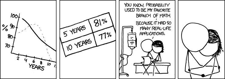
xkcd and I are in sync.  In case you live in a cave, xkcd is a webcomic "of romance, sarcasm, math, and language," by Randall Munroe.  Several times in the last year, the topics that appear in xkcd have been strangely synchronized with topics I am covering in class.

It happened again this week: I was planning to write something about survival analysis and yoga when I read this:


The figure in the first frame is a survival curve.  The solid line is the survival function, S(t), which is the percentage of people who survive at least t years.   The dotted line is the hazard function, which is proportional to the fraction of deaths that occur during year t.  In this figure the death rate is low immediately after diagnosis, highest after 5 years, then decreasing.

The numbers in the second frame are survival rates: 81% survive at least 5 years and 77% survive at least 10.

To explore this topic, and to demonstrate computational techniques in survival analysis, I downloaded data from the Surveillance, Epidemiology and End Results (SEER) Program run by the National Cancer Institute, which is one of the U.S. National Institutes of Health.

SEER collects "data on patient demographics, primary tumor site, tumor morphology and stage at diagnosis, first course of treatment, and follow-up for vital status," currently covering "approximately 28 percent of the US population."

I will use data from the SEER 9 registry, which covers Atlanta, Connecticut, Detroit, Hawaii, Iowa, New Mexico, San Francisco-Oakland, Seattle-Puget Sound, and Utah.  This dataset includes cases diagnosed from 1973 through 2007.

As usual I wrote Python programs to read and parse the datasets.  For my analysis, I select cases of breast cancer where the behavior of the tumor was classified as malignant, where the patient had only one primary tumor, and where the case has been followed up.  There are 370263 records in this subset.

I consider all causes of death, not just deaths due to cancer.  This kind of analysis is most useful for prognosis, but because it includes other causes of death, it depends on patient characteristics like age, health, income, etc.  Also, survival depends strongly on the stage of the cancer.  The best way to deal with that problem is to generate curves that control for these characteristics.  For this example, I limit the analysis to 19168 patients who were in their 30s at the time of diagnosis, but I don't control for other factors.

To estimate survival curves, I use the Kaplan-Meier product-limit method, which is sufficiently obvious that I re-invented it before I knew what it was called.  The following figure shows the survival and hazard curves for this cohort:

These curves are similar to the ones in the cartoon figure, but the 5 and 10 year survival rates are lower, about 75% and 64%.  However, there are a few things to keep in mind:

1) You should not use these curves to make a prognosis for any patient.  This curve includes patients with different stages of cancer and other health factors.  Also...

2) For purposes of demonstration, I am keeping the analysis simple.  People who do this for a living do it more carefully.  And finally...

3) There is a systematic source of bias in this figure: the longest survival times are necessarily based on patients with earlier dates of diagnosis.  In this figure, the leftmost data point is based on a cohort with a mean date of diagnosis in 1992.  The rightmost data point is based on a cohort centered around 1982.  Since patient prognosis improves over time, the entire curve is too pessimistic for current patients, and it gets more pessimistic from left to right.

To see how prognoses are changing over time, I partitioned the dataset by date of diagnosis.  The following figure shows the results:

So prognoses have been improving consistently.  Part of this effect is due to improvements in treatment; part is due to earlier diagnosis.  To distinguish between these causes, we could control for stage of cancer, but I have not done that analysis.

Another reason for optimism is that survival rates generally increase after diagnosis; that is, the longer a patient survives, the longer they are likely to survive.  The following figure shows 5 and 10 year survival rates conditioned on t; that is, Pr(T > t+5 | T > t) and Pr(T > t+10 | T > t):

At the time of diagnosis, the 5-year survival rate is 75%.  But for patients who survive 5 years, the chance of surviving 10 years is 85%, and if you survive 10 years, the chance of surviving 15 is 92%.

In manufacturing, this property is called UBNE, which stands for "used better than new in expectation:" a used part is expected to last longer than a new part, because it has demonstrated its longevity.

Newborn babies, cancer patients and novice motorcyclists have the UBNE property; the longer they live, the longer they are expected to live.  So that's a reason to be optimistic.

Note: Sadly, the xkcd strip might be autobiographical.  I don't know details, but Munroe has indicated that he is dealing with an illness in his family, and several recent strips have been on medical topics.  If my inference is right, I want to extend my best wishes to Mr. Munroe and his family.


Data source: Surveillance, Epidemiology, and End Results (SEER) Program (www.seer.cancer.gov) Research Data (1973-2007), National Cancer Institute, DCCPS, Surveillance Research Program, Cancer Statistics Branch, released April 2010, based on the November 2009 submission.

Update July 31, 2011: Here's an update from xkcd, including a first-person view of a survival curve:

Thursday, March 31, 2011

Freshman hordes more godless than ever!

Since 1978 the percentage of college freshmen whose religious preference is "None" has nearly tripled from 8% to 23%, and the trend is accelerating.


In 2007 I wrote this article for Free Inquiry magazine that reports on survey results from the Cooperative Institutional Research Program (CIRP) of the Higher Education Research Insitute (HERI).  Here is some background on the survey, from my article:
The CIRP survey includes questions about students’ backgrounds, activities, and attitudes. In one question, students were asked their “current religious preference” and given a choice of seventeen common religions and Christian denominations, “Other Christian,” “Other religion,” or “None.” Another question asked students how often they “attended a religious service” in the last year. The choices were “Frequently,” “Occasionally,” and “Not at all.” The instructions directed students to select “Occasionally” if they attended one or more times, so a nonobservant student who attended a wedding and a funeral (and follows instructions) would not be counted among the apostates.
The following figure shows students' responses over the history of the survey (updated with the most recent data):


Here's what I said about this figure 4 years ago:
The number of students with no religious preference has been increasing steadily since the low point ... in 1978. ... The rate of growth from 1980 to the present has been between 0.25 and 0.35 percentage points per year... Since 1997, the rate may have increased to 0.6 or 0.7 percentage points per year.  At that rate, the class of 2056 will have an atheist majority.
A linear extrapolation from data like this is mostly ridiculous, but as it turns out the next four points are pretty much in line.  And finally, I claimed:
Both curves show a possible acceleration between 2005 and 2006. This jump may be due to increased visibility of atheism following the publication of books by Sam Harris, Daniel C. Dennett, and Richard Dawkins.
That last point is pure speculation on my part, but it is also what you might call a testable hypothesis.  Which gives me an excuse to talk about another article of mine, "A novel changepoint detection algorithm," which you can download from arXiv.  Here's the abstract:
We [my imaginary co-author and I] propose an algorithm for simultaneously detecting and locating changepoints in a time series, .... The kernel of the algorithm is a system of equations that computes, for each index i, the probability that the last (most recent) change point occurred at i.
In a time series, a changepoint is a time where the behavior of the system changes abruptly.  By applying my algorithm to the CIRP data, we can test whether there are changepoints and when they are likely to have occurred.


My conjecture is that the rate of increase changed in 1997 and maybe again in 2006.  Since this is a hypothesis about rates, I'll start by computing differences between successive elements as an estimate of the first derivative.  Where there is missing data, I use the average yearly change.  This figure shows the result:


As usual, taking differences amplifies noise and makes it harder to see patterns.  But that's exactly what my algorithm (which is mine) is good for.  Here are the results:


The y-axis is the probability that the last (most recent) change point occurred during a given year, accumulated from right to left.  The gray lines indicate years with a relatively high probability of being the last changepoint.  So, reading from right to left, there is a 5% chance of a changepoint in 2006 and a 5% chance for 1998.  The most likely location of the last changepoint is 1984 (about 20%) or 1975 (25%).  So that provides little if any evidence for my conjecture, which is pretty much what I deserve.


A simpler, and more likely, hypothesis is that the trend is accelerating; that is, the slope is changing continuously, not abruptly.  And that's easy to test by fitting a line to the yearly changes.


The red line shows the linear least squares fit, with slope 0.033; the p-value (chance of seeing an absolute slope as big as that) is 0.006, so you can either reject the null hypothesis or update your subjective degree of belief accordingly.


The fitted value for the current rate of growth is 0.9 percentage points per year, accelerating at 0.033 percentage points per year^2.  So here's my prediction: in 2011 the percentage of freshman who report no religious affiliation will be 23.0 + 0.9 + 0.03 = 23.9%.


Wednesday, March 23, 2011

Predicting marathon times

I ran the New Bedford Half Marathon on Sunday in 1:34:08, which is a personal record for me.  Like a lot of runners in New England, I ran New Bedford as a training run for the Boston Marathon, coming up in about 4 weeks.


In addition to the training, the half marathon is also useful for predicting your marathon time.  There are online calculators where you can type in a recent race time and predict your time at different distances.  Most of them are based on the Riegel formula; here is the explanation from Runners' World:

The Distance Finish Times calculator ... uses the formula T2 = T1 x (D2/D1)^1.06 where T1 is the given time, D1 is the given distance, D2 is the distance to predict a time for, and T2 is the calculated time for D2. 
The formula was developed by Pete Riegel and published first in a slightly different form in Runner's World, August 1977, in an article in that issue entitled "Time Predicting." The formula was refined for other sports (swimming, bicycling, walking,) in an article "Athletic Records and Human Endurance," also written by Pete Riegel, which appeared in American Scientist, May-June 1981.
Based on my half marathon, the formula says I should be able to run a marathon in 3:16:09.  Other predictors use different parameters or different formulas, but even the most conservative prediction is under 3:20, which just happens to be my qualifying time.  So I should be able to qualify, right?


There a few caveats.  First, you have to train for the distance.  If you have never run farther than 13.1 miles, you will have a hard time with the marathon, no matter what your half marathon time is.  For me, this base is covered.  I have been following the FIRST training program since January, including several runs over 20 miles (and another coming up on Sunday).


Second, weather is a factor.  New Bedford this weekend was 40 degF and sunny, which is pretty close to optimal.  But if Marathon Monday is 80 degF, no one is going to hit their target time.


Finally, terrain is a factor.  Boston is a net-downhill course, which would normally make it fast, but with the hills, especially in miles 17-21, Boston is considered a tough course.


So that raises my question-of-the-week: how well does New Bedford predict Boston?


The 2010 results from New Bedford are here, and they are available in an easy-to-parse format.  Results from Boston are here, but you can't download the whole thing; you have to search by name, etc.  So I wrote a program that loops through the New Bedford results and searches for someone in Boston with the same name and age (or age+1 for anyone born under Aries).


I found 520 people who ran both races and I matched up their times.  This scatter plot shows the results:


Not surprisingly, the results are correlated: R^2 is 0.86.  There are a few outliers, which might be different people with the same name and age, or people who had one bad day and one good day.


Now let's fit a curve.  Taking the log of both sides of the Riegel formula, we get


log(T2) = log(T1) + A log(2)


So if we plot T2 vs T1 on a log-log scale, we should see a line with slope 1, and we can estimate the intercept.  This figure shows the result:


The fitted line has slope 1.0 and the intercept that minimizes least squared error.  The estimated intercept corresponds to an exponent in the Riegel model of 1.16, substantially higher than the value used by the race time predictors (1.06).


Visually, the line is not a particularly good fit for the data, which suggests that this model is not capturing the shape of the relationship.  We could certainly look for better models, but instead let's apply Downey's Law, which says "The vast majority of statistical questions in the real world can be answered by counting."


What are my chances of qualifying for Boston?  Let's zoom in on the people who finished near me in New Bedford (minus one year):


The red line isn't a fitted curve; it's the 3:20 line.  Of 50 people who ran my time in New Bedford (plus or minute two minutes) only 13 ran a 3:20 or better in Boston.  So my chances are about 25%.  Or maybe less -- most of those 13 were faster than me.


Why are the race predictors so optimistic?  One possibility is weather.  If Boston was hot last year, that would slow people down.  But according to Wolfram|Alpha, New Bedford on March 21, 2010 was 55-60 degF and sunny.  And Boston on April 18 was 40-50 degF and cloudy.  So if anything we might expect times in Boston to be slightly faster.


The most likely explanation (or at least the only one left) is terrain.  Curse you, Heartbreak Hill!


-----


Update March 24, 2011:  Here's one more figure showing percentiles of marathon times as a function of half marathon time.  The blue line is at 94 minutes; for that time the percentiles are 192, 200, 207, 216 and 239 minutes.  So the median time for people in my cohort is 3:27:00.


Update April 19, 2011: I ran with a group of friends aiming for a 3:25 pace.  We hit the halfway mark in 1:45, so we revised our goal to 3:30.  But I thrashed my quads in the first half and finished in 3:45, pretty close to that dotted blue line.  Still, it was an exciting day and a lot of fun, for some definition of fun.


Update May 17, 2011: It turns out I don't get credit for Downey's Law; Francis Galton beat me to it.  And to make matters worse, he said it better: "Whenever you can, count."


If you find this sort of thing interesting, you might like my free statistics textbook, Think Stats. You can download it or read it at thinkstats.com.