I got Leslie Valiant's new book, Probably Approximately Correct, for Christmas. I'm embarrassed to admit that I was not familiar with the author, especially since he won the Turing Award in 2010. But I wasn't, and that led to a funny sequence of thoughts, which leads to an interesting problem in Bayesian inference.
When I saw the first name "Leslie," I thought that the author was probably female, since Leslie is a primarily female name, at least for young people in the US. But the dust jacket identifies the author as a computer scientist, and when I read that I saw blue and smelled cheese, which is the synesthetic sensation I get when I encounter high-surprisal information that causes large updates in my subjective probabilistic beliefs (or maybe it's just the title of a TV show).
Specifically, the information that the author is a computer scientist caused two immediate updates: I concluded that the author is more likely to be male and, if male, more likely to be British, or old, or both.
A quick flip to the back cover revealed that both of those conclusions were true, but it made me wonder if they were justified. That is, was my internal Bayesian update system (IBUS) working correctly, or leaping to conclusions?
Part One: Is the author male?
To check, I will try to quantify the analysis my IBUS performed. First let's think about the odds that the author is male. Starting with the name "Leslie" I would have guessed that about 1/3 of Leslies are male. So my prior odds were 1:2 against.
Now let's update with the information that Leslie is a computer scientist who writes popular non-fiction. I have read lots of popular computer science books, and of them about 1 in 20 were written by women. I have no idea what fraction of computer science books are actually written by women. My estimate might be wrong because my reading habits are biased, or because my recollection is not accurate. But remember that we are talking about my subjective probabilistic beliefs. Feel free to plug in your own numbers.
Writing this formally, I'll define
M: the author is male
F: the author is female
B: the author is a computer scientist
L: the author's name is Leslie
then
odds(M | L, B) = odds(M | L) like(B | M) / like(B | F)
If the prior odds are 1:2 and the likelihood ratio is 20, the posterior odds are 10:1 in favor of male. Intuitively, "Leslie" is weak evidence that the author is female, but "computer scientist" is stronger evidence that the author is male.
Part Two: Is the author British?
So what led me to think that the author is British? Well, I know that "Leslie" is primarily female in the US, but closer to gender-neutral in the UK. If someone named Leslie is more likely to be male in the UK (compared to the US), then maybe men named Leslie are more likely to be from the UK. But not necessarily. We need to be careful.
If the name Leslie is much more common in the US than in the UK, then the absolute number of men named Leslie might be greater in the US. In that case, "Leslie" would be evidence in favor of the hypothesis that the author is American.
I don't know whether "Leslie" is more popular in the US. I could do some research, but for now I will stick with my subjective update process, and assume that the number of people named Leslie is about the same in the US and the UK.
So let's see what the update looks like. I'll define
US: the author is from the US
UK: the author is from the UK
then
odds(UK | L, B) = odds(UK | B) like(L | UK) / like(L | US)
Again thinking about my collection of popular computer science books, I guess that one author in 10 is from the UK, so my prior odds are about 10:1.
To compute the likelihoods, I use the law of total probability conditioned on the probability that the author is male (which I just computed). So:
like(L | UK) = prob(M) like(L | UK, M) + prob(F) like(L | UK, F)
and
like(L | US) = prob(M) like(L | US, M) + prob(F) like(L | US, F)
Based on my posterior odds from Part One:
prob(M) = 90%
prob(F) = 10%
Assuming that the number of people named Leslie is about the same in the US and the UK, and guessing that "Leslie" is gender neutral in the UK:
like(L | UK, M) = 50%
like(L | UK, F) = 50%
And guessing that "Leslie" is primarily female in the US:
like(L | US, M) = 10%
like(L | US, F) = 90%
Taken together, the likelihood ratio is about 3:1, which means that knowing L and suspecting M is evidence in favor of UK. But not very strong evidence.
Summary
It looks like my IBUS is functioning correctly or, at least, my analysis can be justified provided that you accept the assumptions and guesses that went into it. Since any of those numbers could easily be off by a factor of two, or more, don't take the results too seriously.
Friday, December 27, 2013
Monday, November 25, 2013
Six Ways Coding Teaches Math
Last week I attended the Computer-Based Mathematics Education Summit in New York City, run by Wolfram Research and hosted at UNICEF headquarters.
The motivation behind the summit is explained by Conrad Wolfram in this TED talk. His idea is that mathematical modeling almost always involves these steps:

I presented six ways you can use coding to learn math topics:
If you prove a result mathematically, you can check whether it is true by trying out some examples. For example, in my statistics class, we test the Central Limit Theorem by adding up variates from different distributions. Students get insight into why the CLT works, when it does. And we also try examples where the CLT doesn't apply, like adding up Pareto variates. I hope this exercise helps students remember not just the rule but also the exceptions.
Many mathematical entities are hard to explain because they are so abstract. When you represent these entities as software objects, you define an application program interface (API) that specifies the operations the entities support, and how they interact with other entities. Students can understand what these entities ARE by understanding what they DO.
An example from my statistics class is a library I provide that defines object to represent PMFs, CDFs, PDFs, etc. The methods these object provide define, in some sense, what they are.
This pedagogic approach needed more explaining than the others, and one participant pointed out that it might require more than just basic programming skills. I agreed, but I would also suggest that students benefit from using these APIs, even if they don't design them.
Sometimes math notation and code look similar, but often they are very different. An example that comes up in Think Bayes is a Bayesian update. Here it is in math notation (from Wikipedia):
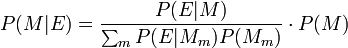
And here is the code:
class Suite(Pmf):
"""Map from hypothesis to probability."""
def update(self, data):
for hypo in self:
like = self.likelihood(data, hypo)
self[hypo] *= like
self.normalize()
If you are a mathematician who doesn't program, you might prefer the first. If you know Python, you probably find the second easier to read. And if you are comfortable with both, you might find it enlightening to see the idea expressed in different ways.
The motivation behind the summit is explained by Conrad Wolfram in this TED talk. His idea is that mathematical modeling almost always involves these steps:
- Posing the right question.
- Taking a real world problem and expressing it in a mathematical formulation.
- Computation.
- Mapping the math formulation back to the real world.
Wolfram points out that most math classes spend all of their time on step 3, and no time on steps 1, 2, and 4. But step 3 is exactly what computers are good at, and what humans are bad at. And furthermore, steps 1, 2, and 4 are important, and hard, and can only be done by humans (at least for now).
So he claims, and I agree, that we should be spending 80% of the time in math classes on steps 1, 2, and 4, and only 20% on computation, which should be done primarily using computers.
When I saw Wolfram's TED talk, I was struck by the similarity of his 4 steps to the framework we teach in Modeling and Simulation, a class developed at Olin College by John Geddes, Mark Somerville, and me. We use this diagram to explain what we mean by modeling:

Our four steps are almost the same, but we use some different language: (1) The globe in the lower left is a physical system you are interested in. You have to make modeling decisions to decide what aspects of the real world can be ignored and which are important to include in the model. (2) The result, in the upper left, is a model, or several models, which you can analyze mathematically or simulate, which gets you to (3) the upper-right corner, a set of results, and finally (4) you have to compare your results with the real world.
The exclamation points represent the work the model does, which might be
- Prediction: What will this system do in the future?
- Explanation: Why does the system behave as it does (and in what regime might it behave differently)?
- Optimization: How can we design this system to behave better (for some definition of "better")?
In Modeling and Simulation, students use simulations more than mathematical analysis, so they can choose to study systems more interesting than what you see in freshman physics. And we don't do the modeling for them. They have to make, and justify, decisions about what should be in the model depending on what kind of work it is intended to do.
Leaving aside whether we should call this activity math, or modeling, or something else, it's clear that Wolfram's framework and ours are getting at the same set of ideas. So I was looking forward to the summit.
I proposed to present a talk called "Six Ways Coding Teaches Math," based on Modeling and Simulation, and also on classes I have developed for Data Science and Bayesian Statistics. For reasons I'm not sure I understand, my proposal was not accepted initially, but on the second day of the conference, I got an email from one of the organizers asking if I could present later that day.
I put some slides together in about 30 minutes and did the presentation two hours later! Here are the slides:
Special thanks to John Geddes, who also attended the CBM summit, and who helped me prepare the presentation and facilitate discussions. And thanks to Mark Somerville, who answered a last minute email and sent the figure above, which is much prettier than my old version.
Here's an outline of what I talked about.
Here's an outline of what I talked about.
Six Ways Coding Teaches Math
My premise is that programming is a pedagogic wedge. If students can write basic programs in any language, they can use that skill to learn almost anything, especially math.
This is also the premise of my book series, which uses Python code to explain statistics, complexity science, and (my current project) digital signal processing.
I presented six ways you can use coding to learn math topics:
1) Translation.
This is probably the most obvious of the six, but students can learn computational mechanisms and algorithms by translating them into code from English, or from math notation, or even from another programming language. Any misunderstandings will be reflected in their code, so when they debug programs, they are also debugging their brains.
This is probably the most obvious of the six, but students can learn computational mechanisms and algorithms by translating them into code from English, or from math notation, or even from another programming language. Any misunderstandings will be reflected in their code, so when they debug programs, they are also debugging their brains.
2) "Proof by example".
If you prove a result mathematically, you can check whether it is true by trying out some examples. For example, in my statistics class, we test the Central Limit Theorem by adding up variates from different distributions. Students get insight into why the CLT works, when it does. And we also try examples where the CLT doesn't apply, like adding up Pareto variates. I hope this exercise helps students remember not just the rule but also the exceptions.
3) Understanding math entities by API design.
Many mathematical entities are hard to explain because they are so abstract. When you represent these entities as software objects, you define an application program interface (API) that specifies the operations the entities support, and how they interact with other entities. Students can understand what these entities ARE by understanding what they DO.
An example from my statistics class is a library I provide that defines object to represent PMFs, CDFs, PDFs, etc. The methods these object provide define, in some sense, what they are.
This pedagogic approach needed more explaining than the others, and one participant pointed out that it might require more than just basic programming skills. I agreed, but I would also suggest that students benefit from using these APIs, even if they don't design them.
4) Option to go top down.
When students have programming skills, you don't have to present every topic bottom-up. You can go top-down; that is, students can start using new tools before they understand how they work.
An example came up when I started working on a new textbook for Digital Signal Processing (DSP). In DSP books, Chapter 1 is usually about complex arithmetic. If you approach the topic mathematically, that's where you have to start. Then it takes 9 chapters and 300 pages to get to the Fast Fourier Transform, which is the most important algorithm in DSP.
Approaching the topic computationally, we can use an implementation of FFT (readily available in any language) to start doing spectral analysis on the first day. Students can download sound files, or record their own, and start looking at spectra and spectrograms right away. Once they understand what spectral analysis is, they are motivated and better prepared to understand how it works. And the exercises are infinitely more interesting.
5) Two bites at each apple.
Some people like math notation and appreciate how it expresses complex ideas concisely. Other people find that the same ideas expressed in code are easier to read. If you present ideas both ways, everyone gets two chances to understand.
Some people like math notation and appreciate how it expresses complex ideas concisely. Other people find that the same ideas expressed in code are easier to read. If you present ideas both ways, everyone gets two chances to understand.
Sometimes math notation and code look similar, but often they are very different. An example that comes up in Think Bayes is a Bayesian update. Here it is in math notation (from Wikipedia):
And here is the code:
class Suite(Pmf):
"""Map from hypothesis to probability."""
def update(self, data):
for hypo in self:
like = self.likelihood(data, hypo)
self[hypo] *= like
self.normalize()
6) Connect to the real world.
Finally, with computational tools, students can work on real world problems. In my Data Science class, students aren't limited to data that comes in the right format, or toy examples from a book. They can work with datasets from almost any source.
And according to Big Data Borat:
UPDATE: Here's an article by Michael Ernst about his class, which combines introductory Python programming and data processing: Teaching intro CS and programming by way of scientific data analysis
Audience participation
So that was my presentation. Then I had a little fun. I asked the participants to assemble into small groups, introduce themselves to their neighbors, and discuss these prompts: Are there other categories in addition to the six I described? Are the people in the audience doing similar things? How do these ideas apply in secondary education, and primary?
After a day and a half of sitting in presentations with limited interaction, many of the participants seemed happy to talk and hear from other participants. Although when you break our active learning methods on a naive audience, not everyone appreciates it!
Anyway, I sat in on a some excellent conversations, and then asked the groups to report out. I wish I could summarize their comments, but I have to concentrate to understand and facilitate group discussion, and I usually don't remember it well afterward.
One concern that came up more than once is the challenge of building programming skills (which my premise takes for granted) in the first place. There are, of course, two options. You can require programming as a prerequisite or teach it on demand. In the Olin curriculum, there are examples of both.
Modeling and Simulation does not require any programming background, and each year about half of the students have no programming experience at all. While they are working on projects, they work on a series of exercises to develop the programming skills they need. And they read "The Cat Book," also known as Physical Modeling in MATLAB.
For most of my other classes, Python programming is a prerequisite. Most students meet the requirement by taking our introductory programming class, which uses my book, Think Python. But some of them just read the book.
That's all for now from the CBM summit. If you read this far, let me ask you the same questions I asked the summit participants:
And according to Big Data Borat:
In Data Science, 80% of time spent prepare data, 20% of time spent complain about need for prepare data.So students work with real data and interact with real clients. Which reminds me: I am looking for external collaborators to work with students in my Data Science class, starting January 2014.
UPDATE: Here's an article by Michael Ernst about his class, which combines introductory Python programming and data processing: Teaching intro CS and programming by way of scientific data analysis
Audience participation
So that was my presentation. Then I had a little fun. I asked the participants to assemble into small groups, introduce themselves to their neighbors, and discuss these prompts: Are there other categories in addition to the six I described? Are the people in the audience doing similar things? How do these ideas apply in secondary education, and primary?
After a day and a half of sitting in presentations with limited interaction, many of the participants seemed happy to talk and hear from other participants. Although when you break our active learning methods on a naive audience, not everyone appreciates it!
Anyway, I sat in on a some excellent conversations, and then asked the groups to report out. I wish I could summarize their comments, but I have to concentrate to understand and facilitate group discussion, and I usually don't remember it well afterward.
One concern that came up more than once is the challenge of building programming skills (which my premise takes for granted) in the first place. There are, of course, two options. You can require programming as a prerequisite or teach it on demand. In the Olin curriculum, there are examples of both.
Modeling and Simulation does not require any programming background, and each year about half of the students have no programming experience at all. While they are working on projects, they work on a series of exercises to develop the programming skills they need. And they read "The Cat Book," also known as Physical Modeling in MATLAB.
For most of my other classes, Python programming is a prerequisite. Most students meet the requirement by taking our introductory programming class, which uses my book, Think Python. But some of them just read the book.
That's all for now from the CBM summit. If you read this far, let me ask you the same questions I asked the summit participants:
- Are there other categories in addition to the six I described?
- Are you doing similar things?
- How do these ideas apply in secondary education, and primary?
Please comment below or send me email.
Wednesday, October 2, 2013
One step closer to a two-hour marathon
This past Sunday Wilson Kipsang ran the Berlin Marathon in 2:03:23, shaving 15 seconds off the world record. That means it's time to check in on the world record progression and update my article from two years ago. The following is a revised version of that article, including the new data point.
Abstract: I propose a model that explains why world record progressions in running speed are improving linearly, and should continue as long as the population of potential runners grows exponentially. Based on recent marathon world records, I extrapolate that we will break the two-hour barrier in 2043.
-----
Let me start with the punchline:
 The blue points show the progression of marathon records since 1970, including Wilson Kipsang's new mark. The blue line is a least-squares fit to the data, and the red line is the target pace for a two-hour marathon, 13.1 mph. The blue line hits the target pace in 2043.
In general, linear extrapolation of a time series is a dubious business, but in this case I think it is justified:
1) The distribution of running speeds is not a bell curve. It has a long tail of athletes who are much faster than normal runners. Below I propose a model that explains this tail, and suggests that there is still room between the fastest human ever born and the fastest possible human.
2) I’m not just fitting a line to arbitrary data; there is theoretical reason to expect the progression of world records to be linear, which I present below. And since there is no evidence that the curve is starting to roll over, I think it is reasonable to expect it to continue for a while.
3) Finally, I am not extrapolating beyond reasonable human performance. The target pace for a two-hour marathon is 13.1 mph, which is slower than the current world record for the half marathon (58:23 minutes, or 13.5 mph). It is unlikely that the current top marathoners will be able to maintain this pace for two hours, but we have no reason to think that it is beyond theoretical human capability.
My model, and the data it is based on, are below.
-----
In April 2011, I collected the world record progression for running events of various distances and plotted speed versus year (here's the data, mostly from Wikipedia). The following figure shows the results:
 You might notice a pattern; for almost all of these events, the world record progression is a remarkably straight line. I am not the first person to notice, but as far as I know, no one has proposed an explanation for the shape of this curve.
Until now -- I think I know why these lines are straight. Here are the pieces:
1) Each person's potential is determined by several factors that are independent of each other; for example, your VO2 max and the springiness of your tendons are probably unrelated.
2) Each runner's overall potential is limited by their weakest factor. For example, if there are 10 factors, and you are really good at 9 of them, but below average on the 10th, you will probably not be a world-class runner.
3) As a result of (1) and (2), potential is not normally distributed; it is long-tailed. That is, most people are slow, but there are a few people who are much faster.
4) Runner development has the structure of a pipeline. At each stage, the fastest runners are selected to go on to the next stage.
5) If the same number of people went through the pipeline each year, the rate of new records would slow down quickly.
6) But the number of people in the pipeline actually grows exponentially.
7) As a result of (5) and (6) the rate of new records is linear.
8) This model suggests that linear improvement will continue as long as the world population grows exponentially.
Let's look at each of those pieces in detail:
Physiological factors that determine running potential include VO2 max, anaerobic capacity, height, body type, muscle mass and composition (fast and slow twitch), conformation, bone strength, tendon elasticity, healing rate and probably more. Psychological factors include competitiveness, persistence, tolerance of pain and boredom, and focus.
Most of these factors have a large component that is inherent, they are mostly independent of each other, and any one of them can be a limiting factor. That is, if you are good at all of them, and bad at one, you will not be a world-class runner. To summarize: there is only one way to be fast, but there are a lot of ways to be slow.
As a simple model of these factors, we can generate a random person by picking N random numbers, where each number is normally-distributed under a logistic transform. This yields a bell-shaped distribution bounded between 0 and 1, where 0 represents the worst possible value (at least for purposes of running speed) and 1 represents the best possible value.
Then to represent the running potential of each person, we compute the minimum of these factors. Here's what the code looks like:
def GeneratePerson(n=10):
factors = [random.normalvariate(0.0, 1.0) for i in range(n)]
logs = [Logistic(x) for x in factors]
return min(logs)
Yes, that's right, I just reduced a person to a single number. Cue the humanities majors lamenting the blindness and arrogance of scientists. Then explain that this is supposed to be an explanatory model, so simplicity is a virtue. A model that is as rich and complex as the world is not a model.
Here's what the distribution of potential looks like for different values of N:

When N=1, there are many people near the maximum value. If we choose 100,000 people at random, we are likely to see someone near 98% of the limit. But as N increases, the probability of large values drops fast. For N=5, the fastest runner out of 100,000 is near 85%. For N=10, he is at 65%, and for N=50 only 33%.
In this kind of lottery, it takes a long time to hit the jackpot. And that's important, because it suggests that even after 7 billion people, we might not have seen anyone near the theoretical limit.
Let's see what effect this model has on the progression of world records. Imagine that we choose a million people and test them one at a time for running potential (and suppose that we have a perfect test). As we perform tests, we keep track of the fastest runner we have seen, and plot the "world record" as a function of the number of tests.
Here's the code:
def WorldRecord(m=100000, n=10):
data = []
best = 0.0
for i in xrange(m):
person = GeneratePerson(n)
if person > best:
best = person
data.append(i/m, best))
return data
And here are the results with M=100,000 people and the number of factors N=10:

The x-axis is the fraction of people we have tested. The y-axis is the potential of the best person we have seen so far. As expected, the world record increases quickly at first and then slows down.
In fact, the time between new records grows geometrically. To see why, consider this: if it took 100 people to set the current record, we expect it to take 100 more to exceed the record. Then after 200 people, it should take 200 more. After 400 people, 400 more, and so on. Since the time between new records grows geometrically, this curve is logarithmic.
So if we test the same number of people each year, the progression of world records is logarithmic, not linear. But if the number of tests per year grows exponentially, that's the same as plotting the previous results on a log scale. Here's what you get:

That's right: a log curve on a log scale is a straight line. And I believe that that's why world records behave the way they do.
This model is unrealistic in some obvious ways. We don't have a perfect test for running potential and we don't apply it to everyone. Not everyone with the potential to be a runner has the opportunity to develop that potential, and some with the opportunity choose not to.
But the pipeline that selects and trains runners behaves, in some ways, like the model. If a person with record-breaking potential is born in Kenya, where running is the national sport, the chances are good that he will be found, have opportunities to train, and become a world-class runner. It is not a certainty, but the chances are good.
If the same person is born in rural India, he may not have the opportunity to train; if he is in the United States, he might have options that are more appealing.
So in some sense the relevant population is not the world, but the people who are likely to become professional runners, given the talent. As long as this population is growing exponentially, world records will increase linearly.
That said, the slope of the line depends on the parameter of exponential growth. If economic development increases the fraction of people in the world who have the opportunity to become professional runners, these curves could accelerate.
So let's get back to the original question: when will a marathoner break the 2-hour barrier? Before 1970, marathon times improved quickly; since then the rate has slowed. But progress has been consistent for the last 40 years, with no sign of an impending asymptote. So I think it is reasonable to fit a line to recent data and extrapolate. Here are the results:

The red line is the target: 13.1 mph. The blue line is a least squares fit to the data. So here's my prediction: there will be a 2-hour marathon in 2043. I'll be 76, so my chances of seeing it are pretty good. But that's a topic for another article (see Chapter 1 of Think Bayes).
Abstract: I propose a model that explains why world record progressions in running speed are improving linearly, and should continue as long as the population of potential runners grows exponentially. Based on recent marathon world records, I extrapolate that we will break the two-hour barrier in 2043.
-----
Let me start with the punchline:

In general, linear extrapolation of a time series is a dubious business, but in this case I think it is justified:
1) The distribution of running speeds is not a bell curve. It has a long tail of athletes who are much faster than normal runners. Below I propose a model that explains this tail, and suggests that there is still room between the fastest human ever born and the fastest possible human.
2) I’m not just fitting a line to arbitrary data; there is theoretical reason to expect the progression of world records to be linear, which I present below. And since there is no evidence that the curve is starting to roll over, I think it is reasonable to expect it to continue for a while.
3) Finally, I am not extrapolating beyond reasonable human performance. The target pace for a two-hour marathon is 13.1 mph, which is slower than the current world record for the half marathon (58:23 minutes, or 13.5 mph). It is unlikely that the current top marathoners will be able to maintain this pace for two hours, but we have no reason to think that it is beyond theoretical human capability.
My model, and the data it is based on, are below.
-----
In April 2011, I collected the world record progression for running events of various distances and plotted speed versus year (here's the data, mostly from Wikipedia). The following figure shows the results:
Until now -- I think I know why these lines are straight. Here are the pieces:
1) Each person's potential is determined by several factors that are independent of each other; for example, your VO2 max and the springiness of your tendons are probably unrelated.
2) Each runner's overall potential is limited by their weakest factor. For example, if there are 10 factors, and you are really good at 9 of them, but below average on the 10th, you will probably not be a world-class runner.
3) As a result of (1) and (2), potential is not normally distributed; it is long-tailed. That is, most people are slow, but there are a few people who are much faster.
4) Runner development has the structure of a pipeline. At each stage, the fastest runners are selected to go on to the next stage.
5) If the same number of people went through the pipeline each year, the rate of new records would slow down quickly.
6) But the number of people in the pipeline actually grows exponentially.
7) As a result of (5) and (6) the rate of new records is linear.
8) This model suggests that linear improvement will continue as long as the world population grows exponentially.
Let's look at each of those pieces in detail:
Physiological factors that determine running potential include VO2 max, anaerobic capacity, height, body type, muscle mass and composition (fast and slow twitch), conformation, bone strength, tendon elasticity, healing rate and probably more. Psychological factors include competitiveness, persistence, tolerance of pain and boredom, and focus.
Most of these factors have a large component that is inherent, they are mostly independent of each other, and any one of them can be a limiting factor. That is, if you are good at all of them, and bad at one, you will not be a world-class runner. To summarize: there is only one way to be fast, but there are a lot of ways to be slow.
As a simple model of these factors, we can generate a random person by picking N random numbers, where each number is normally-distributed under a logistic transform. This yields a bell-shaped distribution bounded between 0 and 1, where 0 represents the worst possible value (at least for purposes of running speed) and 1 represents the best possible value.
Then to represent the running potential of each person, we compute the minimum of these factors. Here's what the code looks like:
def GeneratePerson(n=10):
factors = [random.normalvariate(0.0, 1.0) for i in range(n)]
logs = [Logistic(x) for x in factors]
return min(logs)
Yes, that's right, I just reduced a person to a single number. Cue the humanities majors lamenting the blindness and arrogance of scientists. Then explain that this is supposed to be an explanatory model, so simplicity is a virtue. A model that is as rich and complex as the world is not a model.
Here's what the distribution of potential looks like for different values of N:

When N=1, there are many people near the maximum value. If we choose 100,000 people at random, we are likely to see someone near 98% of the limit. But as N increases, the probability of large values drops fast. For N=5, the fastest runner out of 100,000 is near 85%. For N=10, he is at 65%, and for N=50 only 33%.
In this kind of lottery, it takes a long time to hit the jackpot. And that's important, because it suggests that even after 7 billion people, we might not have seen anyone near the theoretical limit.
Let's see what effect this model has on the progression of world records. Imagine that we choose a million people and test them one at a time for running potential (and suppose that we have a perfect test). As we perform tests, we keep track of the fastest runner we have seen, and plot the "world record" as a function of the number of tests.
Here's the code:
def WorldRecord(m=100000, n=10):
data = []
best = 0.0
for i in xrange(m):
person = GeneratePerson(n)
if person > best:
best = person
data.append(i/m, best))
return data
And here are the results with M=100,000 people and the number of factors N=10:

The x-axis is the fraction of people we have tested. The y-axis is the potential of the best person we have seen so far. As expected, the world record increases quickly at first and then slows down.
In fact, the time between new records grows geometrically. To see why, consider this: if it took 100 people to set the current record, we expect it to take 100 more to exceed the record. Then after 200 people, it should take 200 more. After 400 people, 400 more, and so on. Since the time between new records grows geometrically, this curve is logarithmic.
So if we test the same number of people each year, the progression of world records is logarithmic, not linear. But if the number of tests per year grows exponentially, that's the same as plotting the previous results on a log scale. Here's what you get:

That's right: a log curve on a log scale is a straight line. And I believe that that's why world records behave the way they do.
This model is unrealistic in some obvious ways. We don't have a perfect test for running potential and we don't apply it to everyone. Not everyone with the potential to be a runner has the opportunity to develop that potential, and some with the opportunity choose not to.
But the pipeline that selects and trains runners behaves, in some ways, like the model. If a person with record-breaking potential is born in Kenya, where running is the national sport, the chances are good that he will be found, have opportunities to train, and become a world-class runner. It is not a certainty, but the chances are good.
If the same person is born in rural India, he may not have the opportunity to train; if he is in the United States, he might have options that are more appealing.
So in some sense the relevant population is not the world, but the people who are likely to become professional runners, given the talent. As long as this population is growing exponentially, world records will increase linearly.
That said, the slope of the line depends on the parameter of exponential growth. If economic development increases the fraction of people in the world who have the opportunity to become professional runners, these curves could accelerate.
So let's get back to the original question: when will a marathoner break the 2-hour barrier? Before 1970, marathon times improved quickly; since then the rate has slowed. But progress has been consistent for the last 40 years, with no sign of an impending asymptote. So I think it is reasonable to fit a line to recent data and extrapolate. Here are the results:

The red line is the target: 13.1 mph. The blue line is a least squares fit to the data. So here's my prediction: there will be a 2-hour marathon in 2043. I'll be 76, so my chances of seeing it are pretty good. But that's a topic for another article (see Chapter 1 of Think Bayes).
Wednesday, September 18, 2013
How to consume statistical analysis
I am giving a talk next week for the Data Science Group in Cambridge. It's part six of the Leading Analytics series:
Building your Analytical Skill set
Tuesday, September 24, 20136:00 PM to- Price: $10.00/per person
The subtitle is "How to be a good consumer of statistical analysis." My goal is to present (in about 70 minutes) some basic statistical knowledge a manager should have to work with an analysis team.
Part of the talk is about how to interact with the team: I will talk about an exploration process that is collaborative between analysts and managers, and iterative.
And then I'll introduce topics in statistics, including lots of material from this blog:
- The CDF: the best, and sadly underused, way to visualize distributions.
- Scatterplots, correlation and regression: how to visualize and quantify relationships between variables.
- Hypothesis testing: the most abused tool in statistics.
- Estimation: quantifying and working with uncertainty.
- Visualization: how to use the most powerful and versatile data analysis system in the world, human vision.
Here are the slides I'm planning to present:
Hope you can attend!
Wednesday, August 7, 2013
Are your data normal? Hint: no.
One of the frequently-asked questions over at the statistics subreddit (reddit.com/r/statistics) is how to test whether a dataset is drawn from a particular distribution, most often the normal distribution.
There are standard tests for this sort of thing, many with double-barreled names like Anderson-Darling, Kolmogorov-Smirnov, Shapiro-Wilk, Ryan-Joiner, etc.
But these tests are almost never what you really want. When people ask these questions, what they really want to know (most of the time) is whether a particular distribution is a good model for a dataset. And that's not a statistical test; it is a modeling decision.
All statistical analysis is based on models, and all models are based on simplifications. Models are only useful if they are simpler than the real world, which means you have to decide which aspects of the real world to include in the model, and which things you can leave out.
For example, the normal distribution is a good model for many physical quantities. The distribution of human height is approximately normal (see this previous blog post). But human heights are not normally distributed. For one thing, human heights are bounded within a narrow range, and the normal distribution goes to infinity in both directions. But even ignoring the non-physical tails (which have very low probability anyway), the distribution of human heights deviates in systematic ways from a normal distribution.
So if you collect a sample of human heights and ask whether they come from a normal distribution, the answer is no. And if you apply a statistical test, you will eventually (given enough data) reject the hypothesis that the data came from the distribution.
Instead of testing whether a dataset is drawn from a distribution, let's ask what I think is the right question: how can you tell whether a distribution is a good model for a dataset?
The best approach is to create a visualization that compares the data and the model, and there are several ways to do that.
Comparing to a known distribution
If you want to compare data to a known distribution, the simplest visualization is to plot the CDFs of the model and the data on the same axes. Here's an example from an earlier blog post:

I used this figure to confirm that the data generated by my simulation matches a chi-squared distribution with 3 degrees of freedom.
Many people are more familiar with histograms than CDFs, so they sometimes try to compare histograms or PMFs. This is a bad idea. Use CDFs.
Comparing to an estimated distribution
If you know what family of distributions you want to use as a model, but don't know the parameters, you can use the data to estimate the parameters, and then compare the estimated distribution to the data. Here's an example from Think Stats that compares the distribution of birth weight (for live births in the U.S.) to a normal model.

This figure shows that the normal model is a good match for the data, but there are more light babies than we would expect from a normal distribution. This model is probably good enough for many purposes, but probably not for research on premature babies, which account for the deviation from the normal model. In that case, a better model might be a mixture of two normal distribution.
Depending on the data, you might want to transform the axes. For example, the following plot compares the distribution of adult weight for a sample of Americans to a lognormal model:

I plotted the x-axis on a log scale because under a log transform a lognormal distribution is a nice symmetric sigmoid where both tails are visible and easy to compare. On a linear scale the left tail is too compressed to see clearly.
UPDATE: Someone asked what that graph would look like on a linear scale:

So that gives a sense of what it looks like when you fit a normal model to lognormal data.
Instead of plotting CDFs, a common alternative is a Q-Q plot, which you can generate like this:
def QQPlot(cdf, fit):
"""Makes a QQPlot of the values from actual and fitted distributions.
cdf: actual Cdf
fit: model Cdf
"""
ps = cdf.ps
actual = cdf.xs
fitted = [fit.Value(p) for p in ps]
pyplot.plot(fitted, actual)
cdf and fit are Cdf objects as defined in thinkbayes.py.
The ps are the percentile ranks from the actual CDF. actual contains the corresponding values from the CDF. fitted contains values generated by looping through the ps and, for each percentile rank, looking up the corresponding value in the fitted CDF.
The resulting plot shows fitted values on the x-axis and actual values on the y-axis. If the model matches the data, the plot should be the identity line (y=x).
Here's an example from an earlier blog post:

The blue line is the identity line. Clearly the model a good match for the data, except the last point. In this example, I reversed the axes and put the actual values on the x-axis. It seemed like a good idea at the time, but probably was not.
Comparing to a family of distributions


A normal probability plot is basically a Q-Q plot, so you read it the same way. This figure shows that the data deviate from the model in the range from 1.5 to 2.5 standard deviations below the mean. In this range, the actual birth weights are lower than expected according to the model (I should have plotted the model as a straight line; since I didn't, you have to imagine it).
There's another example of a probability plot (including a fitted line) in this previous post.
The normal probability plot works because the family of normal distributions is closed under linear transformation, so it also works with other stable distributions (see http://en.wikipedia.org/wiki/Stable_distribution).
In summary: choosing an analytic model is not a statistical question; it is a modeling decision. No statistical test that can tell you whether a particular distribution is a good model for your data. In general, modeling decisions are hard, but I think the visualizations in this article are some of the best tools to guide those decisions.
UPDATE:
I got the following question on reddit:
You can read the rest of the conversation here.
There are standard tests for this sort of thing, many with double-barreled names like Anderson-Darling, Kolmogorov-Smirnov, Shapiro-Wilk, Ryan-Joiner, etc.
But these tests are almost never what you really want. When people ask these questions, what they really want to know (most of the time) is whether a particular distribution is a good model for a dataset. And that's not a statistical test; it is a modeling decision.
All statistical analysis is based on models, and all models are based on simplifications. Models are only useful if they are simpler than the real world, which means you have to decide which aspects of the real world to include in the model, and which things you can leave out.
For example, the normal distribution is a good model for many physical quantities. The distribution of human height is approximately normal (see this previous blog post). But human heights are not normally distributed. For one thing, human heights are bounded within a narrow range, and the normal distribution goes to infinity in both directions. But even ignoring the non-physical tails (which have very low probability anyway), the distribution of human heights deviates in systematic ways from a normal distribution.
So if you collect a sample of human heights and ask whether they come from a normal distribution, the answer is no. And if you apply a statistical test, you will eventually (given enough data) reject the hypothesis that the data came from the distribution.
Instead of testing whether a dataset is drawn from a distribution, let's ask what I think is the right question: how can you tell whether a distribution is a good model for a dataset?
The best approach is to create a visualization that compares the data and the model, and there are several ways to do that.
Comparing to a known distribution
If you want to compare data to a known distribution, the simplest visualization is to plot the CDFs of the model and the data on the same axes. Here's an example from an earlier blog post:

I used this figure to confirm that the data generated by my simulation matches a chi-squared distribution with 3 degrees of freedom.
Many people are more familiar with histograms than CDFs, so they sometimes try to compare histograms or PMFs. This is a bad idea. Use CDFs.
Comparing to an estimated distribution
If you know what family of distributions you want to use as a model, but don't know the parameters, you can use the data to estimate the parameters, and then compare the estimated distribution to the data. Here's an example from Think Stats that compares the distribution of birth weight (for live births in the U.S.) to a normal model.

This figure shows that the normal model is a good match for the data, but there are more light babies than we would expect from a normal distribution. This model is probably good enough for many purposes, but probably not for research on premature babies, which account for the deviation from the normal model. In that case, a better model might be a mixture of two normal distribution.
Depending on the data, you might want to transform the axes. For example, the following plot compares the distribution of adult weight for a sample of Americans to a lognormal model:

I plotted the x-axis on a log scale because under a log transform a lognormal distribution is a nice symmetric sigmoid where both tails are visible and easy to compare. On a linear scale the left tail is too compressed to see clearly.
UPDATE: Someone asked what that graph would look like on a linear scale:
So that gives a sense of what it looks like when you fit a normal model to lognormal data.
Instead of plotting CDFs, a common alternative is a Q-Q plot, which you can generate like this:
def QQPlot(cdf, fit):
"""Makes a QQPlot of the values from actual and fitted distributions.
cdf: actual Cdf
fit: model Cdf
"""
ps = cdf.ps
actual = cdf.xs
fitted = [fit.Value(p) for p in ps]
pyplot.plot(fitted, actual)
cdf and fit are Cdf objects as defined in thinkbayes.py.
The ps are the percentile ranks from the actual CDF. actual contains the corresponding values from the CDF. fitted contains values generated by looping through the ps and, for each percentile rank, looking up the corresponding value in the fitted CDF.
The resulting plot shows fitted values on the x-axis and actual values on the y-axis. If the model matches the data, the plot should be the identity line (y=x).
Here's an example from an earlier blog post:

The blue line is the identity line. Clearly the model a good match for the data, except the last point. In this example, I reversed the axes and put the actual values on the x-axis. It seemed like a good idea at the time, but probably was not.
Comparing to a family of distributions
When you compare data to an estimated model, the quality of fit depends on the quality of your estimate. But there are ways to avoid this problem.
For some common families of distributions, there are simple mathematical operations that transform the CDF to a straight line. For example, if you plot the complementary CDF of an exponential distribution on a log-y scale, the result is a straight line (see this section of Think Stats).
For some common families of distributions, there are simple mathematical operations that transform the CDF to a straight line. For example, if you plot the complementary CDF of an exponential distribution on a log-y scale, the result is a straight line (see this section of Think Stats).
Here's an example that shows the distribution of time between deliveries (births) at a hospital in Australia:

The result is approximately a straight line, so the exponential model is probably a reasonable choice.
There are similar transformations for the Weibull and Pareto distributions.
Comparing to a normal distribution
Sadly, things are not so easy for the normal distribution. But there is a good alternative: the normal probability plot.
There are two ways to generate normal probability plots. One is based on rankits, but there is a simpler method:
- From a normal distribution with µ = 0 and σ = 1, generate a sample with the same size as your dataset and sort it.
- Sort the values in the dataset.
- Plot the sorted values from your dataset versus the random values.
Here's an example using the birthweight data from a previous figure:

A normal probability plot is basically a Q-Q plot, so you read it the same way. This figure shows that the data deviate from the model in the range from 1.5 to 2.5 standard deviations below the mean. In this range, the actual birth weights are lower than expected according to the model (I should have plotted the model as a straight line; since I didn't, you have to imagine it).
There's another example of a probability plot (including a fitted line) in this previous post.
The normal probability plot works because the family of normal distributions is closed under linear transformation, so it also works with other stable distributions (see http://en.wikipedia.org/wiki/Stable_distribution).
In summary: choosing an analytic model is not a statistical question; it is a modeling decision. No statistical test that can tell you whether a particular distribution is a good model for your data. In general, modeling decisions are hard, but I think the visualizations in this article are some of the best tools to guide those decisions.
UPDATE:
I got the following question on reddit:
I don't understand. Why not go to the next step and perform a Kolmogorov-Smirnov test, etc? Just looking at plots is good but performing the actual test and looking at plots is better.And here's my reply:
The statistical test does not provide any additional information. Real world data never match an analytic distribution perfectly, so if you perform a test, there are only two possible outcomes:
1) You have a lot of data, so the p-value is low, so you (correctly) conclude that the data did not really come from the analytic distribution. But this doesn't tell you how big the discrepancy is, or whether the analytic model would still be good enough.
2) You don't have enough data, so the p-value is high, and you conclude that there is not enough evidence to reject the null hypothesis. But again, this doesn't tell you whether the model is good enough. It only tells you that you don't have enough data.
Neither outcome helps with what I think is the real problem: deciding whether a particular model is good enough for the intended purpose.
You can read the rest of the conversation here.
Thursday, July 11, 2013
The Geiger Counter problem
I am supposed to turn in the manuscript for Think Bayes next week, but I couldn't resist adding a new chapter. I was adding a new exercise, based on an example from Tom Campbell-Ricketts, author of the Maximum Entropy blog. He got the idea from E. T. Jaynes, author of the classic Probability Theory: The Logic of Science. Here's my paraphrase
So causal information flows down the hierarchy, and inference flows up.
Finally, here's Tom's analysis of the same problem.
Suppose that a radioactive source emits particles toward a Geiger counter at an average rate of r particles per second, but the counter only registers a fraction, f, of the particles that hit it. If f is 10% and the counter registers 15 particles in a one second interval, what is the posterior distribution of n, the actual number of particles that hit the counter, and r, the average rate particles are emitted?I decided to write a solution, and then I liked it so much I decided to make it a chapter. You can read the new chapter here. And then you can take on the exercise at the end:
This exercise is also inspired by an example in Jaynes, Probability Theory. Suppose you buy mosquito trap that is supposed to reduce the population of mosquitoes near your house. Each week, you empty the trap and count the number of mosquitoes captured. After the first week, you count 30 mosquitoes. After the second week, you count 20 mosquitoes. Estimate the percentage change in the number of mosquitoes in your yard.
To answer this question, you have to make some modeling decisions. Here are some suggestions:
- Suppose that each week a large number of mosquitos, N, is bred in a wetland near your home.
- During the week, some fraction of them, f1, wander into your yard, and of those some fraction, f2, are caught in the trap.
- Your solution should take into account your prior belief about how much N is likely to change from one week to the next. You can do that by adding a third level to the hierarchy to model the percent change in N.
I end the chapter with this observation:
The Geiger Counter problem demonstrates the connection between causation and hierarchical modeling. In the example, the emission rate r has a causal effect on the number of particles, n, which has a causal effect on the particle count, k.
The hierarchical model reflects the structure of the system, with causes at the top and effects at the bottom.
- At the top level, we start with a range of hypothetical values for r.
- For each value of r, we have a range of values for n, and the prior distribution of n depends on r.
- When we update the model, we go bottom-up. We compute a posterior distribution of n for each value of r, then compute the posterior distribution of r.
Finally, here's Tom's analysis of the same problem.
Thursday, May 30, 2013
Belly Button Biodiversity: The End Game
In the previous installment of this saga, I admitted that my predictions had completely failed, and I outlined the debugging process I began. Then the semester happened, so I didn't get to work on it again until last week.
It turns out that there were several problems, but the algorithm is now calibrating and validating! Before I proceed, I should explain how I am using these words:
If the analysis calibrates, but fails to validate, that suggests that there is some difference between the model and reality that is causing a problem. And that turned out to be the case.
Here are the problems I discovered, and what I had to do to fix them:
The prior distribution of prevalences
For the prior I used a Dirichlet distribution with all parameters set to 1. I neglected to consider the "concentration parameter," which represents the prior belief about how uniform or concentrated the prevalences are. As the concentration parameter approaches 0, prevalences tend to be close to 1 or 0; that is, there tends to be one dominant species and many species with small prevalences. As the concentration parameter gets larger, all species tend to have the same prevalence. It turns out that a concentration parameter near 0.1 yields a distribution of prevalences that resembles real data.
The prior distribution of n
With a smaller concentration parameter, there are more species with small prevalences, so I had to increase the range of n (the number of species). The prior distribution for n is uniform up to an upper bound, where I choose the upper bound to be big enough to avoid cutting off non-negligible probability. I had to increase this upper bound to 1000, which slows the analysis down a little, but it still takes only a few seconds per subject (on my not-very-fast computer).
Up to this point I hadn't discovered any real errors; it was just a matter of choosing appropriate prior distributions, which is ordinary work for Bayesian analysis.
But it turns out there were two legitimate errors.
Bias due to the definition of "unseen"
I was consistently underestimating the prevalence of unseen species because of a bias that underlies the definition of "unseen." To see the problem, consider a simple scenario where there are two species, A and B, with equal prevalence. If I only collect one sample, I get A or B with equal probability.
Suppose I am trying to estimate the prevalence of A. If my sample is A, the posterior marginal distribution for the prevalence of A is Beta(2, 1), which has mean 2/3. If the sample is B, the posterior is Beta(1, 2), which has mean 1/3. So the expected posterior mean is the average of 2/3 and 1/3, which is 1/2. That is the actual prevalence of A, so this analysis is unbiased.
But now suppose I am trying to estimate the prevalence of the unseen species. If I draw A, the unseen species is B and the posterior mean is 1/3. If I draw B, the unseen species is A and the posterior mean is 1/3. So either way I believe that the prevalence of the unseen species is 1/3, but it is actually 1/2. Since I did not specify in advance which species is unseen, the result is biased.
This seems obvious in retrospect. So that's embarrassing (the price I pay for this experiment in Open Science), but it is easy to fix:
a) The posterior distribution I generate has the right relative prevalences for the seen species (based on the data) and the right relative prevalences for the unseen species (all the same), but the total prevalence for the unseen species (which I call q) is too low.
b) Fortunately, there is only one part of the analysis where this bias is a problem: when I draw a sample from the posterior distribution. To fix it, I can draw a value of q from the correct posterior distribution (just by running a forward simulation) and then unbias the posterior distribution with the selected value of q.
Here's the code that generates q:
def RandomQ(self, n):
# generate random prevalences
dirichlet = thinkbayes.Dirichlet(n, conc=self.conc)
prevalences = dirichlet.Random()
# generate a simulated sample
pmf = thinkbayes.MakePmfFromItems(enumerate(prevalences))
cdf = pmf.MakeCdf()
sample = cdf.Sample(self.num_reads)
seen = set(sample)
# add up the prevalence of unseen species
q = 0
for species, prev in enumerate(prevalences):
if species not in seen:
q += prev
return q
n is the hypothetical number of species. conc is the concentration parameter. RandomQ creates a Dirichlet distribution, draws a set of prevalences from it, then draws a simulated sample with the appropriate number of reads, and adds up the total prevalence of the species that don't appear in the sample.
And here's the code that unbiases the posterior:
def Unbias(self, n, m, q_desired):
params = self.params[:n].copy()
x = sum(params[:m])
y = sum(params[m:])
a = x + y
g = q_desired * a / y
f = (a - g * y) / x
params[:m] *= f
params[m:] *= g
n is the hypothetical number of species; m is the number seen in the actual data.
x is the total prevalence of the seen species; y is the total prevalence of the unseen species. f and g are the factors we have to multiply by so that the corrected prevalence of unseen species is q_desired.
After fixing this error, I find that the analysis calibrates nicely.

From each predictive distribution I generate credible intervals with ideal percentages 10, 20, ... 90, and then count how often the actual value falls in each interval.
For example, the blue line is the calibration curve for n, the number of species. After 100 runs, the 10% credible interval contains the actual value 9.5% of of the time.The 50% credible interval contains the actual value 51.5% of the time. And the 90% credible interval contains the actual value 88% of the time. These results show that the posterior distribution for n is, in fact, the posterior distribution for n.
The results are similar for q, the prevalence of unseen species, and l, the predicted number of new species seen after additional sampling.
To check whether the analysis validates, I used the dataset collected by the Belly Button Biodiversity project. For each subject with more than 400 reads, I chose a random subset of 100 reads, ran the analysis, and checked the predictive distributions for q and n. I can't check the predictive distribution of n, because I don't know the actual value.
Sadly, the analysis does not validate with the collected data. The reason is:
The data do not fit the model
The data deviate substantially from the model that underlies the analysis. To see this, I tried this experiment:
a) Use the data to estimate the parameters of the model.
b) Generate fake samples from the model.
c) Compare the fake samples to the real data.
Here's a typical result:

The blue line is the CDF of prevalences, in order by rank. The top-ranked species makes up about 27% of the sample. The top 10 species make up about 75%, and the top 100 species make up about 90%.
The green lines show CDFs from 10 fake samples. The model is a good match for the data for the first 10-20 species, but then it deviates substantially. The prevalence of rare species is higher in the data than in the model.
The problem is that the real data seem to come from a mixture of two distributions, one for dominant species and one for rare species. Among the dominant species the concentration parameter is near 0.1. For the rare species, it is much higher; that is, the rare species all have about the same prevalence.
There are two possible explanations: this effect might be real or it might be an artifact of errors in identifying reads. If it's real, I would have to extend my model to account for it. If it is due to errors, it might be possible to clean the data.
I have heard from biologists that when a large sample yields only a single read of a particular species, that read is likely to be in error; that is, the identified species might not actually be present.
So I explored a simple error model with the following features:
1) If a species appears only once after r reads, the probability that the read is bogus is p = (1 - alpha/r), where alpha is a parameter.
2) If a species appears k times after n reads, the probability that all k reads are bogus is p^k.
To clean the data, I compute the probability that each observed species is bogus, and then delete it with the computed probability.

With cleaned data (alpha=50), the model fits very nicely. And since the model fits, and the analysis calibrates, we expect the analysis to validate. And it does.

For n there is no validation curve because we don't know the actual values.
For q the validation curve is a little off because we only have a lower bound for the prevalence of unseen species, so the actual values used for validation are too high.
But for l the validation curve is quite good, and that's what we are actually trying to predict, after all.
At this point the analysis depends on two free parameters, the concentration parameter and the cleaning parameter, alpha, which controls how much of the data gets discarded as erroneous.
So the next step is to check whether these parameters cross-validate. That is, if we tune the parameters based on a training set, how well do those values do on a test set?
Another next step is to improve the error model. I chose something very simple, and it does a nice job of getting the data to conform to the analysis model, but it is not well motivated. If I can get more information about where the errors are coming from, I could take a Bayesian approach (what else?) and compute the probability that each datum is legit or bogus.
Or if the data are legit and the prevalences are drawn from a mixture of Dirichlet distributions with different concentrations, I will have to extend the analysis accordingly.
Summary
There were four good reasons my predictions failed:
1) The prior distribution of prevalences had the wrong concentration parameter.
2) The prior distribution of n was too narrow.
3) I neglected an implicit bias due to the definition of "unseen species."
4) The data deviate from the model the analysis is based on. If we "clean" the data, it fits the model and the analysis validates, but the cleaning process is a bit of a hack.
I was able to solve these problems, but I had to introduce two free parameters, so my algorithm is not as versatile as I hoped. However, it seems like it should be possible to choose these parameters automatically, which would be an improvement.
And now I have to stop, incorporate these corrections into Think Bayes, and then finish the manuscript!
It turns out that there were several problems, but the algorithm is now calibrating and validating! Before I proceed, I should explain how I am using these words:
- Calibrate: Generate fake data from the same model the analysis is based on. Run the analysis on fake data and generate predictive distributions. Check whether the predictive distributions are correct.
- Validate: Using real data, generate a rarefied sample. Run the analysis on the sample and generate predictive distributions. Check whether the predictive distributions are correct.
If the analysis calibrates, but fails to validate, that suggests that there is some difference between the model and reality that is causing a problem. And that turned out to be the case.
Here are the problems I discovered, and what I had to do to fix them:
The prior distribution of prevalences
For the prior I used a Dirichlet distribution with all parameters set to 1. I neglected to consider the "concentration parameter," which represents the prior belief about how uniform or concentrated the prevalences are. As the concentration parameter approaches 0, prevalences tend to be close to 1 or 0; that is, there tends to be one dominant species and many species with small prevalences. As the concentration parameter gets larger, all species tend to have the same prevalence. It turns out that a concentration parameter near 0.1 yields a distribution of prevalences that resembles real data.
The prior distribution of n
With a smaller concentration parameter, there are more species with small prevalences, so I had to increase the range of n (the number of species). The prior distribution for n is uniform up to an upper bound, where I choose the upper bound to be big enough to avoid cutting off non-negligible probability. I had to increase this upper bound to 1000, which slows the analysis down a little, but it still takes only a few seconds per subject (on my not-very-fast computer).
Up to this point I hadn't discovered any real errors; it was just a matter of choosing appropriate prior distributions, which is ordinary work for Bayesian analysis.
But it turns out there were two legitimate errors.
Bias due to the definition of "unseen"
I was consistently underestimating the prevalence of unseen species because of a bias that underlies the definition of "unseen." To see the problem, consider a simple scenario where there are two species, A and B, with equal prevalence. If I only collect one sample, I get A or B with equal probability.
Suppose I am trying to estimate the prevalence of A. If my sample is A, the posterior marginal distribution for the prevalence of A is Beta(2, 1), which has mean 2/3. If the sample is B, the posterior is Beta(1, 2), which has mean 1/3. So the expected posterior mean is the average of 2/3 and 1/3, which is 1/2. That is the actual prevalence of A, so this analysis is unbiased.
But now suppose I am trying to estimate the prevalence of the unseen species. If I draw A, the unseen species is B and the posterior mean is 1/3. If I draw B, the unseen species is A and the posterior mean is 1/3. So either way I believe that the prevalence of the unseen species is 1/3, but it is actually 1/2. Since I did not specify in advance which species is unseen, the result is biased.
This seems obvious in retrospect. So that's embarrassing (the price I pay for this experiment in Open Science), but it is easy to fix:
a) The posterior distribution I generate has the right relative prevalences for the seen species (based on the data) and the right relative prevalences for the unseen species (all the same), but the total prevalence for the unseen species (which I call q) is too low.
b) Fortunately, there is only one part of the analysis where this bias is a problem: when I draw a sample from the posterior distribution. To fix it, I can draw a value of q from the correct posterior distribution (just by running a forward simulation) and then unbias the posterior distribution with the selected value of q.
Here's the code that generates q:
def RandomQ(self, n):
# generate random prevalences
dirichlet = thinkbayes.Dirichlet(n, conc=self.conc)
prevalences = dirichlet.Random()
# generate a simulated sample
pmf = thinkbayes.MakePmfFromItems(enumerate(prevalences))
cdf = pmf.MakeCdf()
sample = cdf.Sample(self.num_reads)
seen = set(sample)
# add up the prevalence of unseen species
q = 0
for species, prev in enumerate(prevalences):
if species not in seen:
q += prev
return q
n is the hypothetical number of species. conc is the concentration parameter. RandomQ creates a Dirichlet distribution, draws a set of prevalences from it, then draws a simulated sample with the appropriate number of reads, and adds up the total prevalence of the species that don't appear in the sample.
And here's the code that unbiases the posterior:
def Unbias(self, n, m, q_desired):
params = self.params[:n].copy()
x = sum(params[:m])
y = sum(params[m:])
a = x + y
g = q_desired * a / y
f = (a - g * y) / x
params[:m] *= f
params[m:] *= g
n is the hypothetical number of species; m is the number seen in the actual data.
x is the total prevalence of the seen species; y is the total prevalence of the unseen species. f and g are the factors we have to multiply by so that the corrected prevalence of unseen species is q_desired.
After fixing this error, I find that the analysis calibrates nicely.

From each predictive distribution I generate credible intervals with ideal percentages 10, 20, ... 90, and then count how often the actual value falls in each interval.
For example, the blue line is the calibration curve for n, the number of species. After 100 runs, the 10% credible interval contains the actual value 9.5% of of the time.The 50% credible interval contains the actual value 51.5% of the time. And the 90% credible interval contains the actual value 88% of the time. These results show that the posterior distribution for n is, in fact, the posterior distribution for n.
The results are similar for q, the prevalence of unseen species, and l, the predicted number of new species seen after additional sampling.
To check whether the analysis validates, I used the dataset collected by the Belly Button Biodiversity project. For each subject with more than 400 reads, I chose a random subset of 100 reads, ran the analysis, and checked the predictive distributions for q and n. I can't check the predictive distribution of n, because I don't know the actual value.
Sadly, the analysis does not validate with the collected data. The reason is:
The data do not fit the model
The data deviate substantially from the model that underlies the analysis. To see this, I tried this experiment:
a) Use the data to estimate the parameters of the model.
b) Generate fake samples from the model.
c) Compare the fake samples to the real data.
Here's a typical result:

The blue line is the CDF of prevalences, in order by rank. The top-ranked species makes up about 27% of the sample. The top 10 species make up about 75%, and the top 100 species make up about 90%.
The green lines show CDFs from 10 fake samples. The model is a good match for the data for the first 10-20 species, but then it deviates substantially. The prevalence of rare species is higher in the data than in the model.
The problem is that the real data seem to come from a mixture of two distributions, one for dominant species and one for rare species. Among the dominant species the concentration parameter is near 0.1. For the rare species, it is much higher; that is, the rare species all have about the same prevalence.
There are two possible explanations: this effect might be real or it might be an artifact of errors in identifying reads. If it's real, I would have to extend my model to account for it. If it is due to errors, it might be possible to clean the data.
I have heard from biologists that when a large sample yields only a single read of a particular species, that read is likely to be in error; that is, the identified species might not actually be present.
So I explored a simple error model with the following features:
1) If a species appears only once after r reads, the probability that the read is bogus is p = (1 - alpha/r), where alpha is a parameter.
2) If a species appears k times after n reads, the probability that all k reads are bogus is p^k.
To clean the data, I compute the probability that each observed species is bogus, and then delete it with the computed probability.

With cleaned data (alpha=50), the model fits very nicely. And since the model fits, and the analysis calibrates, we expect the analysis to validate. And it does.

For n there is no validation curve because we don't know the actual values.
For q the validation curve is a little off because we only have a lower bound for the prevalence of unseen species, so the actual values used for validation are too high.
But for l the validation curve is quite good, and that's what we are actually trying to predict, after all.
At this point the analysis depends on two free parameters, the concentration parameter and the cleaning parameter, alpha, which controls how much of the data gets discarded as erroneous.
So the next step is to check whether these parameters cross-validate. That is, if we tune the parameters based on a training set, how well do those values do on a test set?
Another next step is to improve the error model. I chose something very simple, and it does a nice job of getting the data to conform to the analysis model, but it is not well motivated. If I can get more information about where the errors are coming from, I could take a Bayesian approach (what else?) and compute the probability that each datum is legit or bogus.
Or if the data are legit and the prevalences are drawn from a mixture of Dirichlet distributions with different concentrations, I will have to extend the analysis accordingly.
Summary
There were four good reasons my predictions failed:
1) The prior distribution of prevalences had the wrong concentration parameter.
2) The prior distribution of n was too narrow.
3) I neglected an implicit bias due to the definition of "unseen species."
4) The data deviate from the model the analysis is based on. If we "clean" the data, it fits the model and the analysis validates, but the cleaning process is a bit of a hack.
I was able to solve these problems, but I had to introduce two free parameters, so my algorithm is not as versatile as I hoped. However, it seems like it should be possible to choose these parameters automatically, which would be an improvement.
And now I have to stop, incorporate these corrections into Think Bayes, and then finish the manuscript!
Tuesday, May 28, 2013
Python Epistemology at PyCon Taiwan
This weekend I gave a talk entitled "Python Epistemology" for PyCon Taiwan 2013. I would have loved to be in Taipei for the talk, but sadly I was in an empty room in front of a teleconference screen.
Python Epistemology: PyCon Taiwan 2013
As I explained, the title is more grandiose than accurate. In general, epistemology is the theory of knowledge: how we know what we think we know, etc. This talk is mostly about what Python has taught me about programming, and how programming in Python has changed the way I learn and the way I think.
About programming, I wrote:
I gave an example using the Counter data structure to check for anagrams:
This is a nice solution because it is concise and demonstrably correct, but I suggested that one limitation is that it does not extend easily to handle "The Scrabble Problem": given a set of tiles, check to see whether you can spell a given word.
We can define a new class, called Multiset, that extends Counter and provides
for char, count in self.items():
if other[char] < count:
return False
return True
Paul Graham, "Programming Bottom Up," 1993.
About programming, I wrote:
Programming is not about translating a well-known solution into code, it is about discovering solutions by writing code, and then creating the language to express them.
I gave an example using the Counter data structure to check for anagrams:
from collections import Counter
def is_anagram(word1, word2):
return Counter(word1) == Counter(word2)
This is a nice solution because it is concise and demonstrably correct, but I suggested that one limitation is that it does not extend easily to handle "The Scrabble Problem": given a set of tiles, check to see whether you can spell a given word.
We can define a new class, called Multiset, that extends Counter and provides
is_subset
:
class Multiset(Counter):
"""A set with repeated elements."""
def is_subset(self, other):
"""A set with repeated elements."""
def is_subset(self, other):
for char, count in self.items():
if other[char] < count:
return False
return True
Now we can write can_spell concisely:
def can_spell(word, tiles):
return Multiset(word).is_subset(Multiset(tiles))
return Multiset(word).is_subset(Multiset(tiles))
I summarized by quoting Paul Graham:
"... you don't just write your program down toward the language, you also build the language up toward your program.
"In the end your program will look as if the language had been designed for it. And ... you end up with code which is clear, small, and efficient."
Paul Graham, "Programming Bottom Up," 1993.
In the second half of the talk, I suggested that Python and other modern programming languages provide a new approach to solving problems. Traditionally, we tend to think and explore using natural language, do analysis and solve problems using mathematical notation, and then translate solutions from math notation into programming languages.
In some sense, we are always doing two translations, from natural language to math and from math to a computer program. With the previous generation of programming languages, this process was probably necessary (for reasons I explained), but I claim that it is less necessary now, and that it might be possible and advantageous to skip the intermediate mathematics and do analysis and problem-solving directly in programming languages.
After the talk, I got two interesting questions by email. Yung-Cheng Lin suggested that although programming languages are more precise than natural language, they might not be sufficiently precise to replace mathematical notation, and he asked if I think that using programming to teach mathematical concepts might cause misunderstandings for students.
I replied:
I understand what you mean when you say that programming languages are less rigorous that mathematical notation. I think many people have the same impression, but I wonder if it is a real difference or a bias we have.
I would argue that programming languages and math notation are similar in the sense that they are both formal languages designed by people to express particular ideas concisely and precisely.
There are some kinds of work that are easier to do in math notation, like algebraic manipulation, but other kinds of work that are easier in programming languages, like specifying computations, especially computations with state.
You asked if there is a danger that students might misunderstand mathematical ideas if they come to them through programming, rather than mathematical instruction. I'm sure it's possible, but I don't think the danger is specific to the programming approach.
And on the other side, I think a computational approach to mathematical topics creates opportunities for deeper understanding by running experiments, and (as I said in the talk) by getting your ideas out of your head and into a program so that, by debugging the program, you are also debugging your own understanding.
In response to some of my comments about pseudocode, A. T. Cheng wrote:
When we do algorithms or pseudocodes in the traditional way, we used to figure out the time complexity at the same time. But the Python examples you showed us, it seems not so easy to learn the time complexity in the first place. So, does it mean that when we think Python, we don't really care about the time complexity that much?
I replied:
You are right that it can be more difficult to analyze a Python program; you have to know a lot about how the Python data structures are implemented. And there are some gotchas; for example, it takes constant time to add elements to the end of a list, but linear time to add elements in the beginning or the middle.
It would be better if Python made these performance characteristics part of the interface, but they are not. In fact, some implementations have changed over time; for example, the += operator on lists used to create a new list. Now it is equivalent to append.
Thanks to both of my correspondents for these questions (and for permission to quote them). And thanks to the organizers of PyCon Taiwan, especially Albert Chun-Chieh Huang, for inviting me to speak. I really enjoyed it.
Subscribe to:
Posts (Atom)