And here are my slides:
The code for the talk is in an IPython notebook you can view on nbviewer. It is still a work in progress!
And here's the punchline graph:
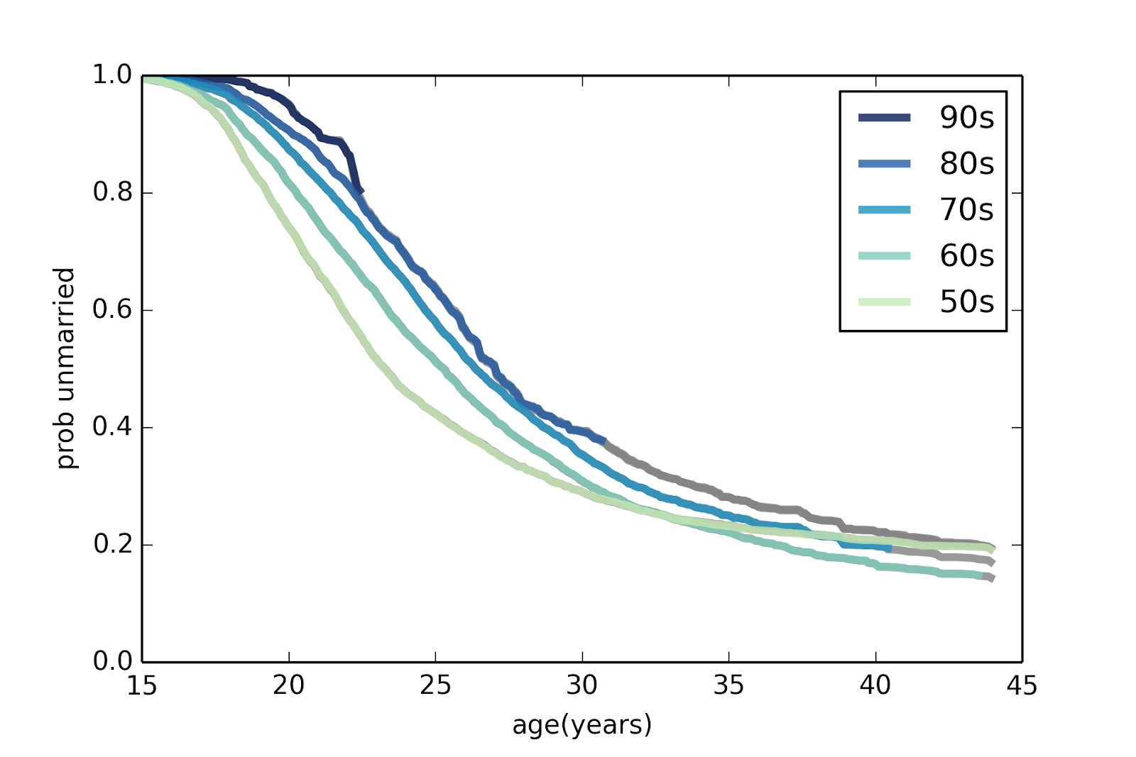
Each line corresponds to a different cohort: 50s means women born during the 1950s, and so on. The curves show the probability of being unmarried as a function of age; for example, about 50% of women born in the 50s had been married by age 23. For women born in the 80s, only about 25% were married by age 23.
The gray lines show predictions based on applying patterns from previous cohorts.
A few patterns emerge from this figure:
1) Successive generations of women are getting married later and later. No surprise there.
2) For women born in the 50s, the curve leveled off; if they didn't marry early, they were unlikely to marry at all. For later generations, the curve keeps dropping, which indicates some women getting married for the first time at later ages.
3) The predictions suggest that the fraction of women who eventually marry is not changing substantially. My predictions for Millennials suggest that they will end up marrying, eventually, at rates similar to previous cohorts.
No comments:
Post a Comment